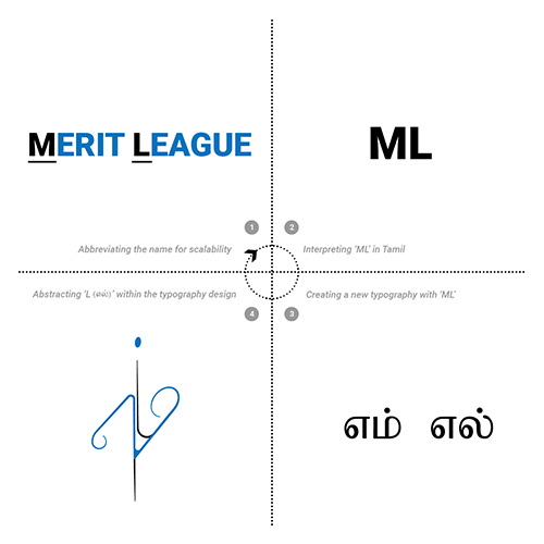
When beginning to think about what could become the face of the Merit League, the logo, the one thing that Gowri was particular about was ensuring the design should go with everything. If one thinks of the contracting field, the logos that are developed generally carry bricks, sloping roofs, and other commonalities. Gowri did not want that.
Gowri was also particular about one other thing – that the logo should be in Tamil. Although the starting point of the company was in Chennai when work takes us outside the city, and outside the country, the logo should be a reflection of where it all started. And maybe tomorrow, the scope of Merit League might not stay restricted to construction. The ambitious aspirations of the team might expand the scope to bring a cafe, bakery, anything etc under the umbrella! Hence, the necessity to ensure that the logo offered the space to carry all these aspirations and avenues was crucial.
Lastly, coming down to the design, it was vital that the design was scalable and able to adapt itself to fit onto something as tiny as the nib of an ink pen.
The flow and shape were designed in such a manner that they incorporated all that is mentioned as part of the thought process and carried the additional layer of seeming as if it is hand-drawn. The latter was paramount as everything the ML works on is hands-on, and this is reflected in how the logo has shaped up.


